


You know that feeling when an outfit looks beautiful on its own, but the moment you put everything together, something just feels… off? The fit is right. The fabric is lovely. The accessories are working. And yet, the look doesn't have that effortless, polished finish you were hoping for.
Very often, the culprit is colour. We tend to think of colour combinations for clothes as a simple matter of matching two shades that look good together. But dressing well is less about making colours match and more about making them belong together. Because there's a fine line between vibrant and overwhelming, coordinated and predictable, and colourful and chaotic.
And if your idea of style is rich, graceful and quietly luxurious, here's where a little colour wisdom can change everything.
First, Try the “Too Much” Test
Picture this: a bright pink kurta, a vibrant orange dupatta, colourful bangles and a pair of equally bright heels. Every piece is beautiful together? Your eyes don't know where to look first. This is one of the easiest ways to make an outfit feel less refined. When every colour is competing for attention, the beauty of the individual pieces gets lost. Instead, let one shade take centre stage.
A vivid pink paired with ivory suddenly feels elegant. A bright orange balanced with beige feels warm and sophisticated. A jewel-toned blue against a neutral base allows the colour to make an impact without taking over the entire look. Think of colour like conversation: if everyone speaks at once, no one gets heard.

Then There’s the “Everything Matches” Trap
Matching used to be the golden rule of dressing. Same-coloured shoes. Same handbag. Same jewellery. Same shade everywhere. But today's idea of polished dressing is much more relaxed. Your colours don't have to be identical. They simply need to complement each other. Imagine a deep plum outfit with a soft lavender accent. Or navy paired with powder blue. Or a rich wine shade brought to life with muted gold. The colours are related, but they're not twins.
That small difference gives an outfit personality. So, when you're thinking about a colour combination for a dress, don't immediately reach for the exact same shade. Look around the colour family. Sometimes the most beautiful pairing is sitting just a few shades away.
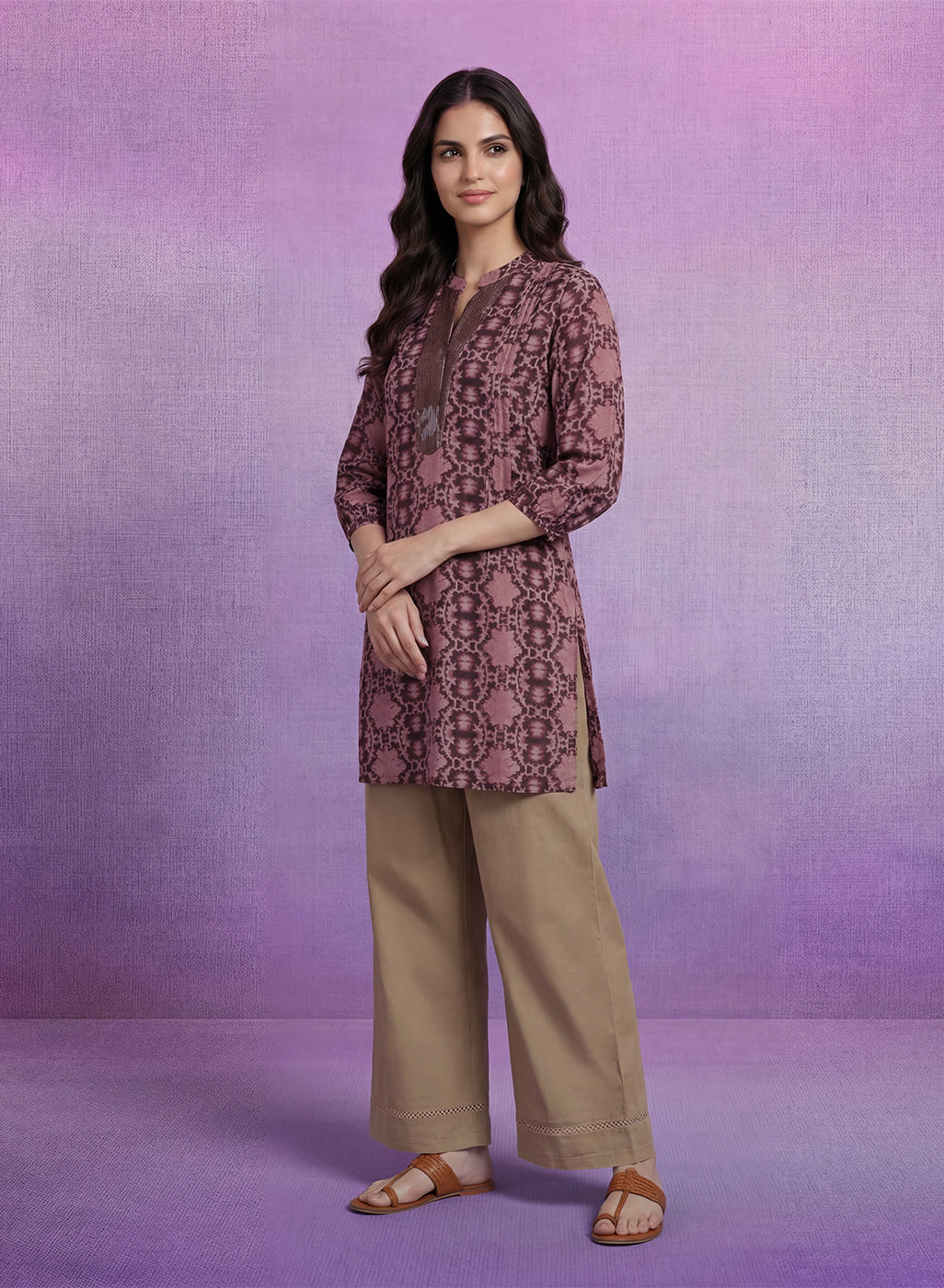
What About Black and Brown?
Black and brown have both earned their place as wardrobe classics. But pairing two very dark versions of them can sometimes make an outfit feel heavy. The solution isn't to declare black and brown enemies.
It's to introduce contrast. Chocolate brown with black can feel incredibly sophisticated when the textures or tones are different. Tan accessories can instantly lift an all-black look. Caramel against deep brown creates warmth without losing that polished feel. This is where fabric can make a difference too. A matte brown paired with a glossy black, for example, creates visual interest even when the colours themselves are understated. Sometimes, elegance isn't about adding more. It's about adding just enough.
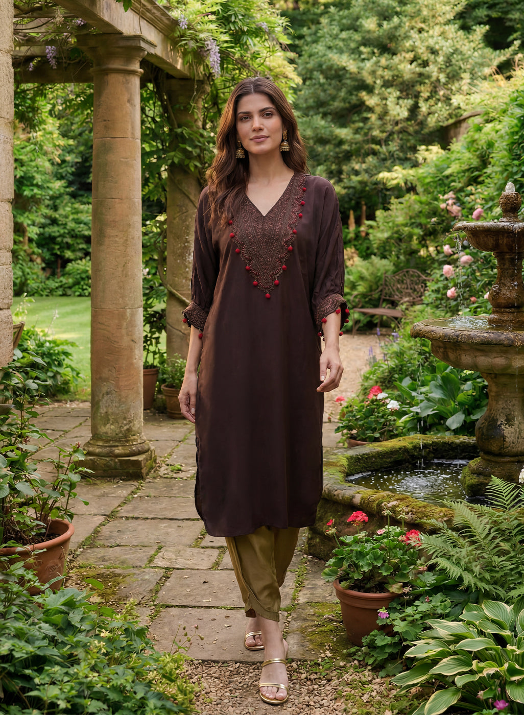
Bright Red and Green? Change the Mood
Red and green aren't bad together. In fact, they're gorgeous when handled thoughtfully. The problem comes when both shades are extremely bright and equally dominant. Instead of a vivid red with an equally vivid green, consider the quieter versions of both, wine and olive or Burgundy and sage or Rust and forest green.
Suddenly, the combination feels deeper, richer and far more sophisticated. This is particularly beautiful in Indian wear, where colour plays such an important role. A slightly muted or deeper palette can give an outfit a luxurious quality without taking away its festive character.
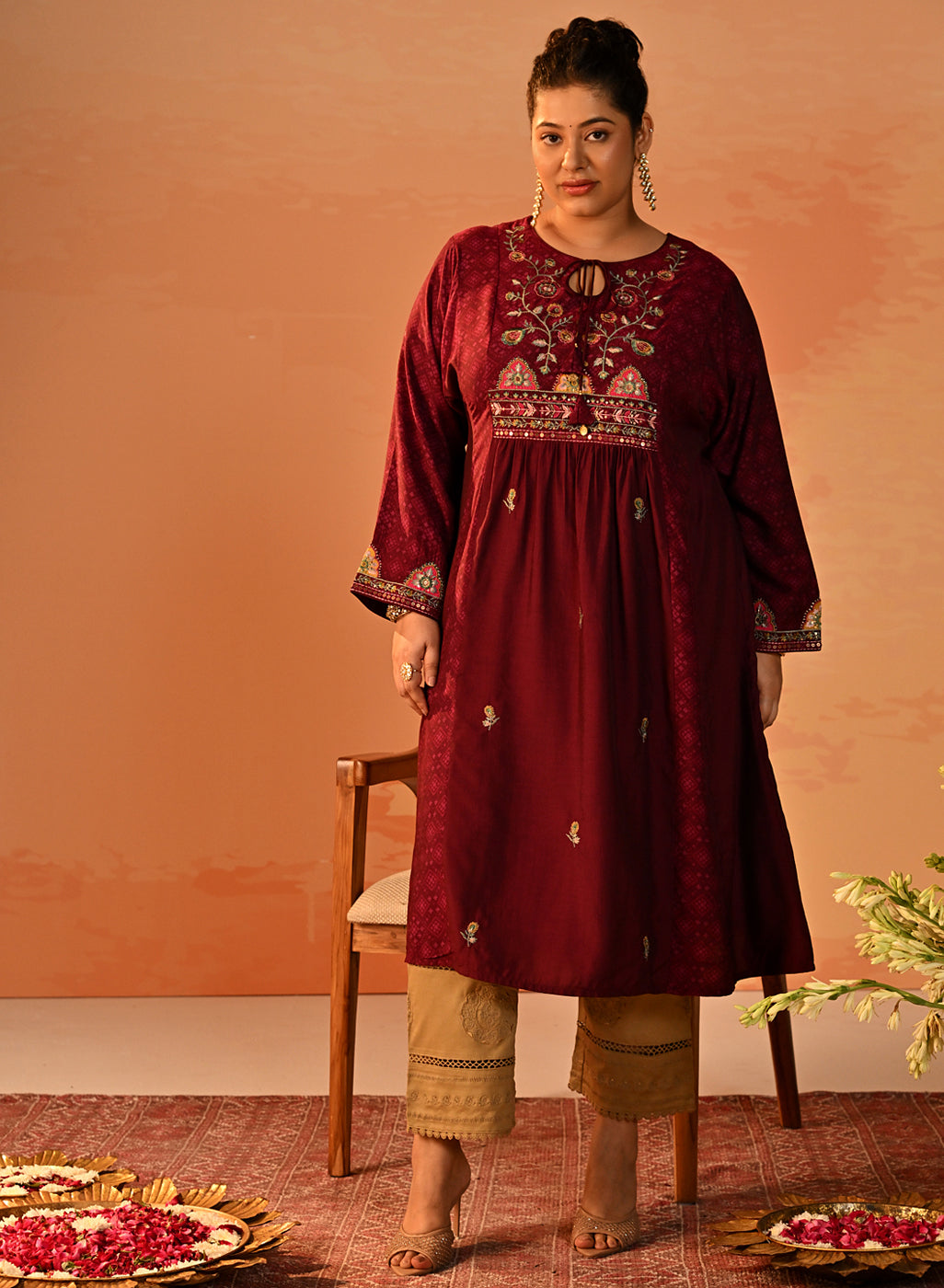
The Pastel Problem No One Talks About
Pastels are having their moment and honestly, we understand why. Powder blue, blush pink, lavender, mint, peach they bring a softness to an outfit that is difficult to recreate with stronger colours. But there's such a thing as too much softness. Put four or five pale shades together and the outfit can start to look washed out, particularly when there isn't enough contrast.
The fix? Give your pastels something to lean against. Blush with ivory or Lavender with grey or Powder blue with navy or Peach with a warm beige. The pastel remains the star, but the deeper or neutral shade gives the outfit structure.
And Then There Are Undertones
Here's a little secret that can completely change the way you approach colour matching clothes: not every version of a colour behaves the same way. A warm beige isn't the same as a cool beige. A blue can lean icy or slightly warm. Pink can have peachy, rosy or bluish undertones. When colours with completely different undertones are placed together, they can sometimes look disconnected even when they seem like they should work on paper.
If you're unsure, start with shades that share a similar temperature. Warm tones such as rust, mustard, terracotta, camel and warm beige naturally create a rich palette. Cooler shades such as lavender, dusty pink, icy blue and slate grey create something softer and more contemporary. And neutrals? They're the great peacekeepers of the wardrobe.
So, What Actually Looks Expensive?
Here's the interesting part. A rich-looking outfit doesn't necessarily need expensive-looking colours. It needs balance. Think about some of the most timeless combinations:
- Emerald + ivory + gold.
- Burgundy + beige.
- Navy + powder blue.
- Chocolate + cream.
- Wine + blush.
None of these combinations are screaming for attention. Yet they immediately feel considered. That's the secret. When choosing the best colour combinations for clothes, don't ask, “Do these colours match?” Ask: “Do these colours allow each other to look beautiful?” That one question can change everything.
Just a Colour, But Make It Yours
Of course, fashion doesn't come with a rulebook. If you love bright colours, wear them. If black and brown are your favourite combination, own it. If you adore head-to-toe pastels, there is absolutely no reason to stop. The idea isn't to tell you what you can't wear. It's to help you understand why some combinations feel effortlessly elegant—and how you can recreate that feeling in your own wardrobe.
At Lakshita, colour is part of the story. It lives in the richness of traditional Indian palettes, the softness of contemporary hues, the glow of festive shades and the understated beauty of timeless neutrals. Because the most beautiful colour combinations for women aren't always the ones that follow a trend.
They're the ones that feel like you. And when the colours, silhouette and details come together just right, you don't notice the styling. You simply notice the woman wearing it.
FAQs
What colour combinations should I avoid for an elegant look?
Avoid pairing too many bright or competing colours together. Instead, balance vibrant shades with neutrals or softer tones to create a more polished and sophisticated look.
How do I choose the right colour combination for a dress?
Consider the occasion, your personal style, and the undertones of the colours. Combining one statement shade with a complementary or neutral colour can create a balanced and elegant colour combination for a dress.
What are some of the best colour combinations for clothes?
Some timeless combinations include emerald with ivory and gold, burgundy with beige, navy with powder blue, chocolate with cream, and wine with blush.
How can I improve my colour matching clothes?
Start by choosing colours with complementary or similar undertones. You can also use neutrals such as ivory, beige, navy, charcoal, and chocolate to balance stronger shades and create sophisticated colour combinations for women.
