


Who doesn’t like a good picture? Every outing, any outfit, any occasion, every woman wants to be captured in a good photo. And yet, there are days when you look perfectly fine in the mirror but somehow don't feel the same way about the pictures.
Your outfit colour can have something to do with it.
The shade you wear close to your face affects how your complexion comes across in different lighting. Some colours add warmth, some create contrast and others give your overall look a softer appearance.
So, if you are dressing for an occasion where you know the camera will be around, here are seven shades to keep in mind. These aren't strict rules—just best colours to wear for photos when you want your outfit and your face to work well together.
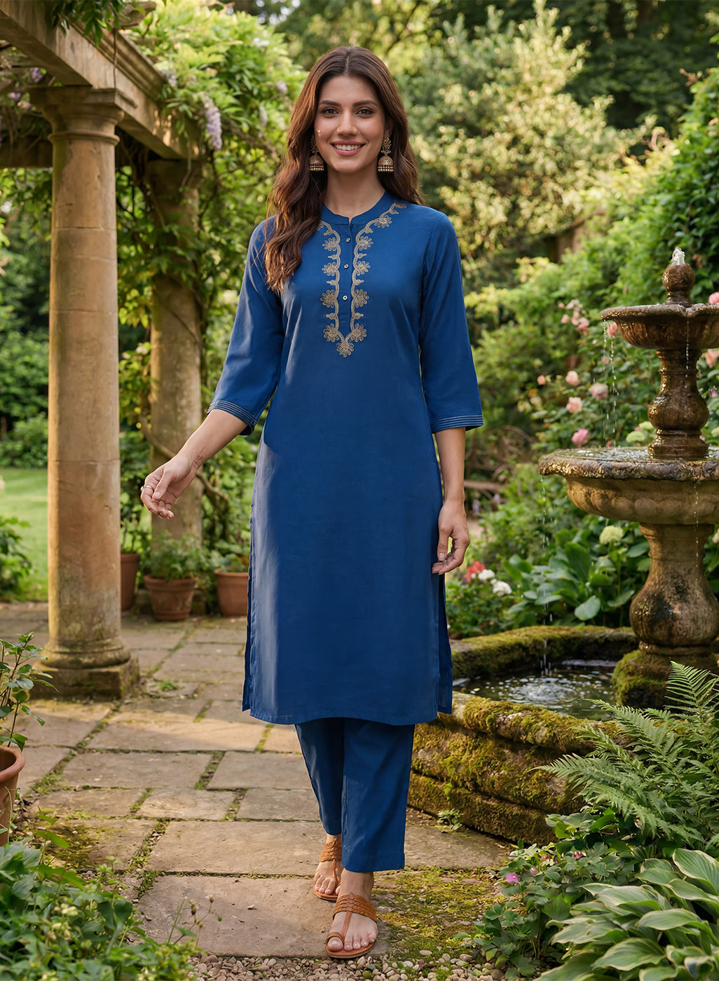
Royal Blue Brings Beautiful Contrast to Your Look
Royal blue is a colour that tends to stand out without taking over the entire picture. It has enough depth to create contrast, which can be particularly flattering when you are wearing a simple silhouette.
A royal blue kurta set is an easy choice for a family gathering, dinner or festive occasion. Keep the jewellery understated during the day or add gold earrings when dressing up for the evening.
It is also a useful colour when your background is fairly neutral because the outfit doesn't disappear into the surroundings.
Emerald Green Has a Naturally Festive Feel
Emerald green and Indian ethnic wear have always made a good combination. The shade feels festive on its own, so you don't necessarily need elaborate styling to make it work.
For women wondering about colours that suit Indian skin tone, deeper greens are a good starting point. They can work across different complexions and look especially lovely with traditional gold jewellery.
Try emerald with:
- Gold jhumkas for a classic combination
- Minimal accessories for a more modern outfit
- A contrasting dupatta when you want a little more colour
Choose Maroon When You Want Something Classic
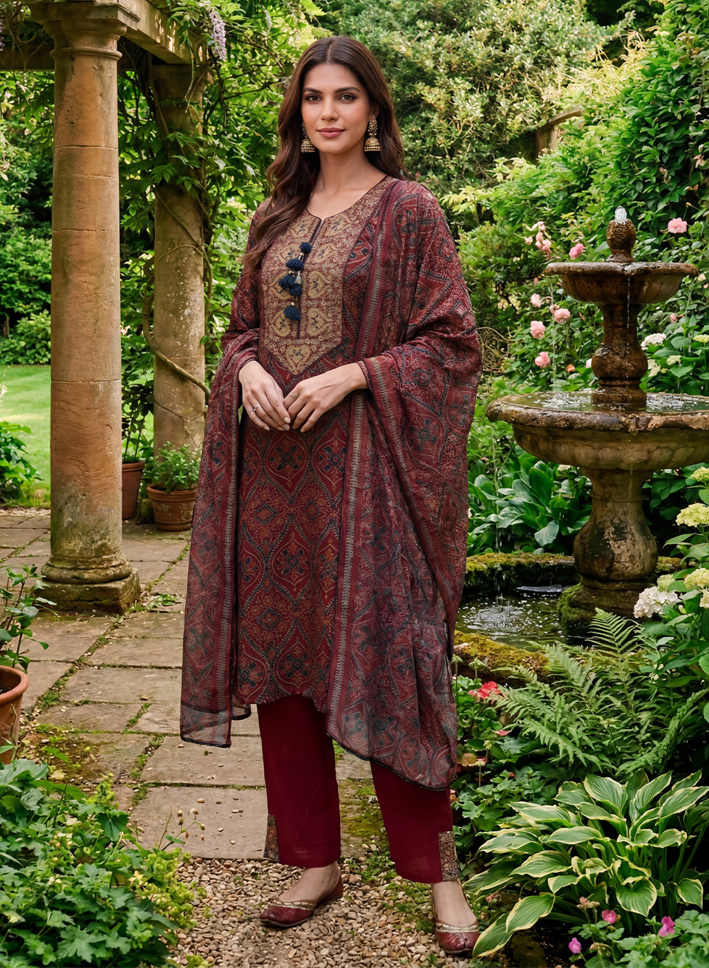
Maroon doesn't need much introduction. It has been part of Indian festive wardrobes for generations and it continues to work because it is easy to wear and easy to style.
Unlike a very bright red, maroon has a deeper finish that can feel a little more sophisticated. It is particularly suited to evening celebrations, festive dinners and wedding functions.
Wine and burgundy can give you a similar effect if you want to move slightly away from traditional maroon.
Soft Pinks Can Make Daytime Pictures Feel Fresh
Not every occasion calls for a deep or dramatic shade.
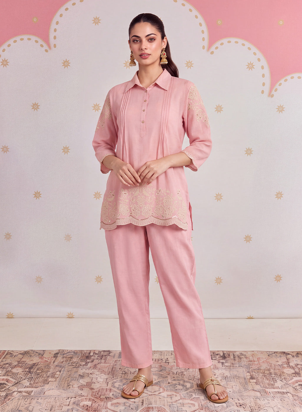
Blush pink, dusty rose and muted pinks are lovely choices for daytime events. They have a lighter feel and pair easily with delicate embroidery, pearls or minimal jewellery.
Think about a pastel pink kurta for:
- Brunches and lunches
- Daytime family celebrations
- Mehendi or intimate festive gatherings
- Casual occasions where you still want to look dressed up
If you usually wear darker colours, a softer pink can be an easy way to change things up.
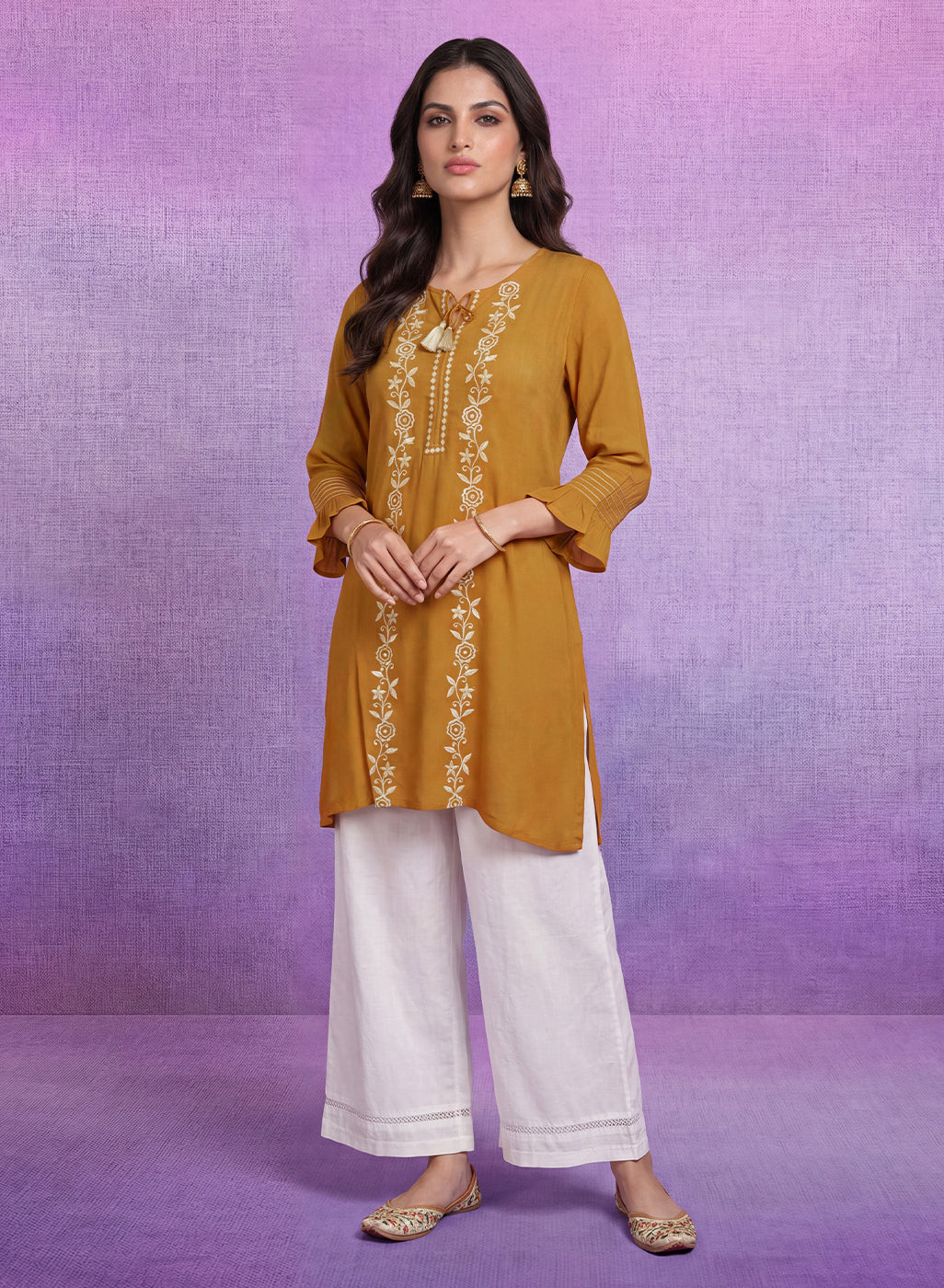
Mustard Adds Warmth Without Looking Too Bright
Mustard yellow has plenty of personality, but it doesn't have the sharpness that a very bright yellow can sometimes have.
That makes it particularly interesting for ethnic outfits. Against natural or earthy backgrounds, mustard can give photographs a warm, lively feel.
A mustard kurta with a contrasting dupatta and traditional earrings is enough to create an outfit that catches attention. You don't need to add too many accessories when the colour is already doing the talking.
It is also one of the best colours to wear when you want something cheerful without reaching for a very bright shade.
Teal Is for Anyone Tired of the Usual Colours
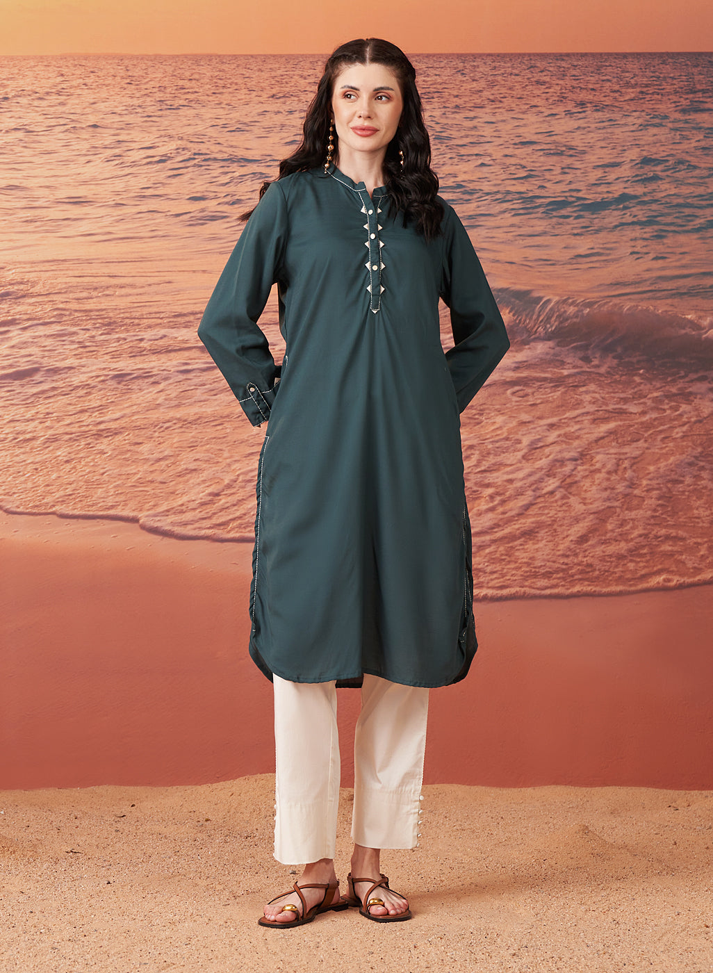
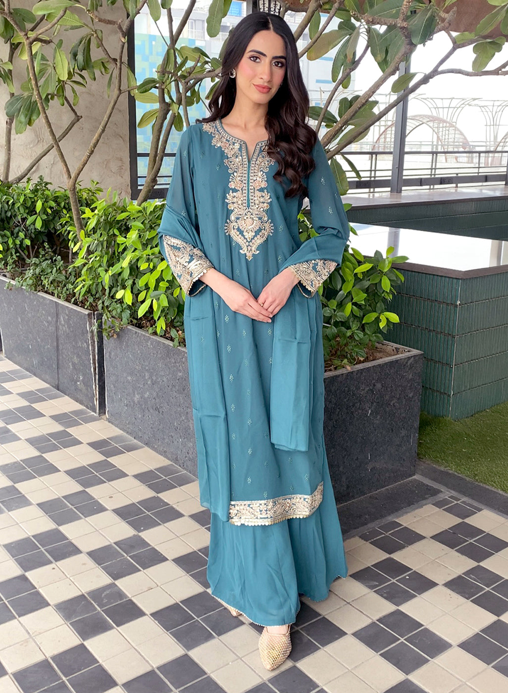
If your wardrobe is already full of reds, pinks and greens, try teal.
The blue-green shade is different enough to make an outfit interesting but still easy to style. It works particularly well with simpler silhouettes where you want the colour to be the main feature.
Silver jewellery gives teal a cooler, contemporary feel, while gold makes it more festive. Either way, it is among the colours that look good in photos when you want something a little less expected.
Ivory Keeps the Focus on Your Face
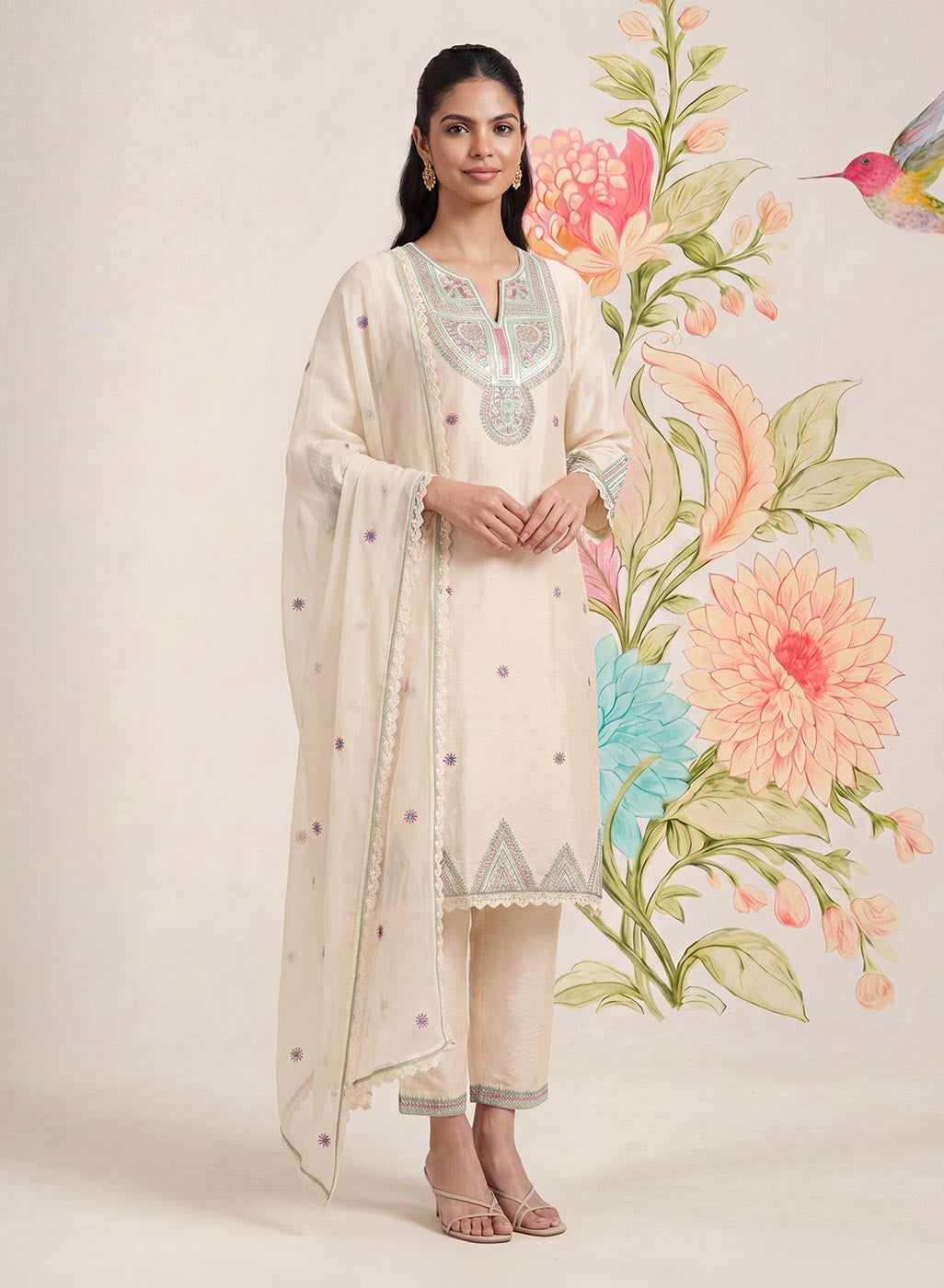
There is something very effortless about an ivory outfit.
Cream, ivory and warm beige don't compete for attention, which can be useful when your outfit has embroidery, textured fabric or statement jewellery. They also work well when you want a photograph that feels simple rather than heavily styled.
A few ways to keep an ivory outfit from looking too plain:
- Choose interesting embroidery or textured fabric
- Add gold or pearl jewellery
- Introduce colour through your dupatta or footwear
- Use a stronger lip colour if that suits your style
For a daytime celebration, an ivory kurta can look just as appropriate as a brighter festive shade.
The Colour Isn't the Only Thing That Matters
Before deciding on the best colours for photos, think about where those photos will actually be taken.
Natural daylight can make softer shades look beautiful, while evening lighting often works well with deeper colours. Your background matters too. A dark outfit against a dark wall may not give you enough separation, while a lighter outfit can get lost against a pale background.
Your fabric also makes a difference. Satin and other reflective materials can behave differently under flash, while cotton, silk blends and textured fabrics tend to give the colour more dimension.
Most importantly, consider your own colouring rather than following a list blindly. The same shade can look completely different depending on your undertone, makeup, jewellery and even the colour of your hair.
Find the Shades You Keep Coming Back To
There is no single answer to the question of colours that make you look beautiful.
You might find that jewel tones bring out your features, while someone else feels their best in soft pastels. Instead of limiting yourself to a particular colour chart, pay attention to the outfits you naturally receive compliments in—or the ones you simply feel better wearing.
The next time you are trying outfits before an important occasion, take a quick photo in natural light. Compare a few different shades side by side. You may be surprised by which one makes your face look the brightest.
Because ultimately, the best colours to wear aren't just the ones that photograph well. They are the ones that make you feel comfortable, confident and completely yourself when the camera comes out.
FAQs
What colour should I wear for outdoor photos?
For outdoor pictures, shades like royal blue, emerald green, mustard and teal can stand out nicely against natural surroundings. Softer colours such as blush pink also work well in bright daylight.
Which colours photograph well for festive occasions?
Deep jewel tones such as emerald, royal blue, maroon and teal are great choices for festive occasions. They pair easily with traditional jewellery and work particularly well for evening celebrations.
How do I choose a colour according to my skin tone?
Start by noticing your skin’s undertone. Warm undertones generally work well with earthy and golden shades, cooler undertones can suit jewel tones, while neutral undertones have more flexibility to experiment.
Does the fabric of an outfit affect how its colour looks in photos?
Yes. Highly reflective fabrics can appear brighter under flash or strong lighting, while textured and matte fabrics usually show colour more naturally. The lighting and surroundings can also change how a shade appears on camera.
